Mobile First Web Development
Post Date:
01/01/70

It's surprising to me that in today's technological world many web developers are not focusing on creating their websites with a mobile first focus. Most people view websites on their mobile devices more than on desktop computers. According to Statista web statistics, mobile web traffic went from 31.16% in 2015 to 58.99% in 2022 (Mobile Device Web Traffic). So more and more people are viewing websites on their mobile devices over desktop computers, and I believe this trend will continue to grow.
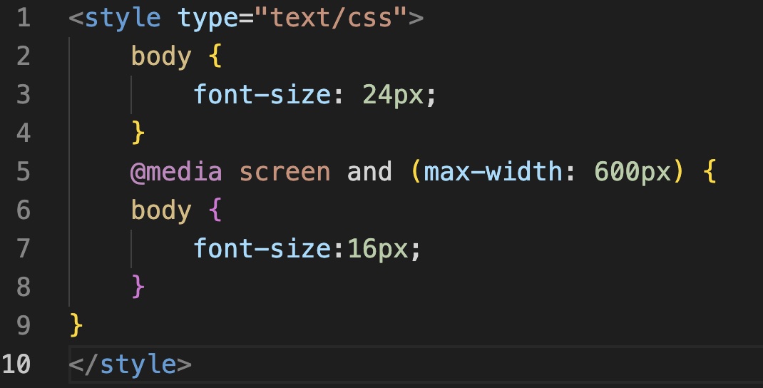
So what is mobile first development? It's simply developing your website with mobile and tablet views in mind first before designing/developing your desktop version of the site. To do this, you can use CSS Media Queries. With CSS media queries you can tell the browser how you want your website to show when on mobile devices. In the example below you can see that I used a media query to change the font size of a website for mobile devices where the screen size is less than 600 pixels wide.
This is just one of many things you can do with media queries. Media queries can change any css you have and target specific screen sizes when working towards making your website responsive to mobile devices.
Another way to create a great mobile first website is by using a toolkit called Bootstrap. Bootstrap is a CSS/JavaScript toolkit that does much of the heavy lifting for you in making your site responsive. Just include the script link and css link in your heading and start using by adding 'class' names to your code. For example, if you wanted to make a button out of a link, you can do so by adding "class='btn'" to the link. You can do that and so much more with Bootstrap.
It takes about 50 milliseconds for someone to form an opinion about your website which determines whether or not they will stay on your site (Swear.com). Considering that almost 60% of users view websites on their mobile devices, I would say how your site looks on mobile is extremely important.

About the Author
Tim is a Senior Full Stack PHP Developer of over 12 years. He has also programmed a few mobile applications using React Native. Tim enjoys creating web applications as well as teaching others how to do what he does.